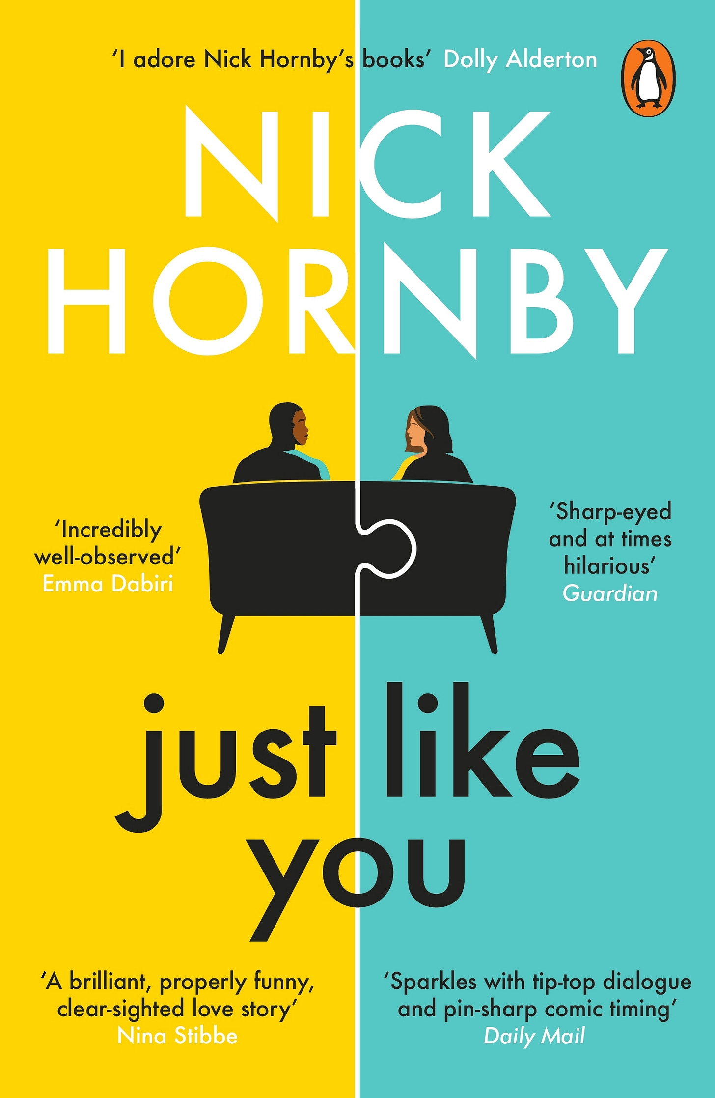
Books are looking dull these days. I’m only in my 20s, so I’ve only known lacklustre book aesthetics, but my adventures in used bookstores have revealed an insight into the pleasures the 19th-century reader experienced. Cool book covers.
NO SHADE TO NICK HORBY OR EVEN THE DESIGNER.
I’m sure the graphic designer had little creative input having to be constrained by the influences of capitalistic cookie-cutter publishing, which demands that books follow similar aesthetic trends to minimize risk when publishing a book.
That is the world we live in. I mean, this isn’t even a bad example, but these graphical elements of this cover are found in so many books published today.
Bright, contrasting colours
Bold sans serif font
Illustrated individuals
Just overly simple aesthetics
See this book cover below. Different, but the same.
Keep reading with a 7-day free trial
Subscribe to Philosophy Learned to keep reading this post and get 7 days of free access to the full post archives.


